 An intergovernmental space organization comprised of 22 European countries, which is involved in the exploration of space for the benefit of its members. As a premier space organization, ESA is involved in a number of space activities, including:
The European Space Agency, which has its headquarters in Paris, France, boasts of a large space mission portfolio that includes missions such as:
The agency is also planning a number of future missions, which include:
ESA’s logo is simple and effective and consists of the agencies initials and a simple circular graphic that represents the Earth. The logo uses single color (usually a light blue) which can be switched to ensure enough contrast when placed on a range of background colors. This improves the visibility of the logo from a distance or when viewed on spacecraft or hardware. The agency benefits from adhering to a strict policy of sticking to brand guidelines, and enjoys a consistent feel across the website and marketing materials.
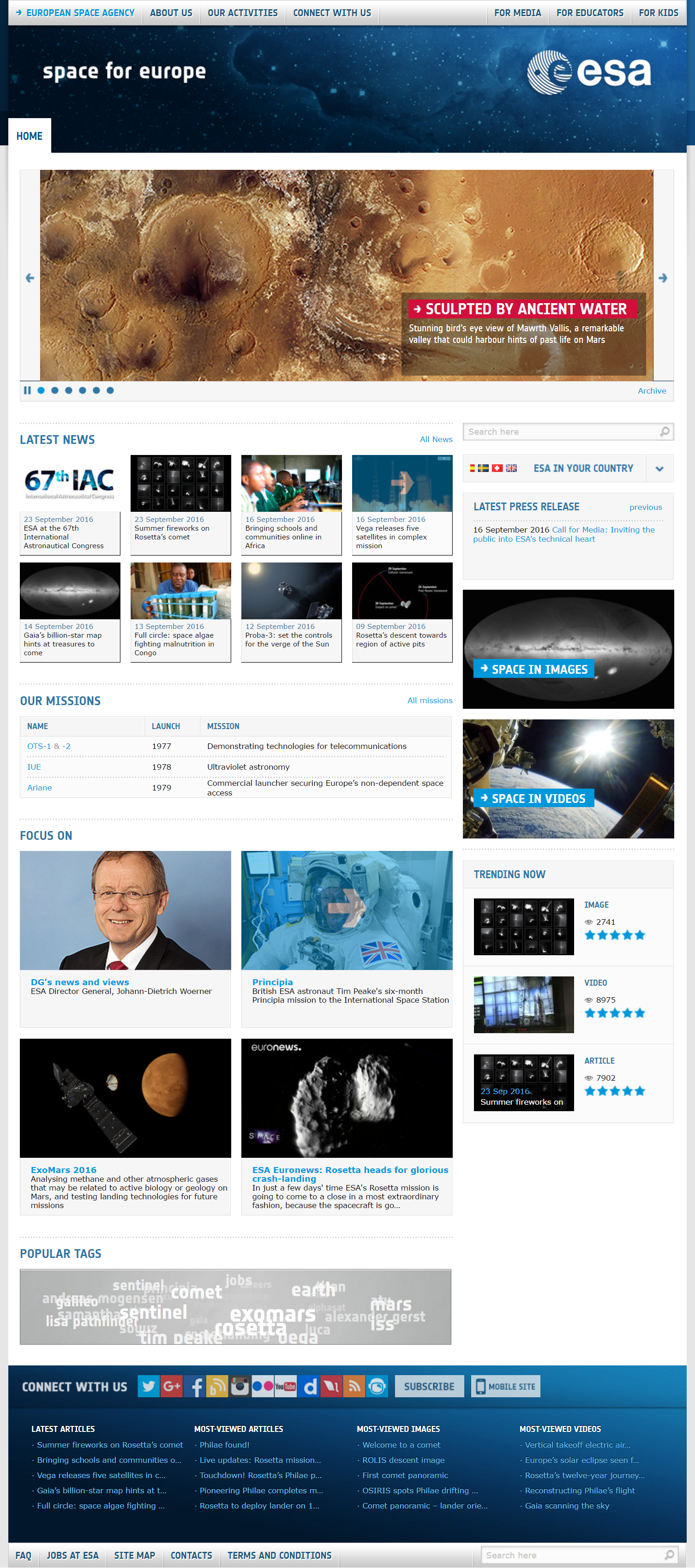
The site’s homepage is designed using a grid-based layout, where the main content is squeezed between two sidebar columns that contain links to important information pages. The site makes use of high-quality and informative web copy which is written in simple, easy to translate language. The footer links are a great way to direct visitors to important pages and another great feature is the country specific section that lists all relevant posts relating to each member state.
Web editors seem to have over-tagged many articles in the news section, causing them to compete with each other in the search results. Examples of the site’s large number of duplicate content issues this generates can be seen on urls such as the System SSA and System SSA2 pages, and elsewhere throughout the site. Despite the great design and considerable resources ploughed into the site it contains a large number of broken links and achieved the lowest SEO score out of all those audited.
ESA’s website has a great call to action section in the footer area of the site that is intended for use by the general public rather than businesses or other organizations who want to engage with the agency. It is comprised of a subscribe button and several social media buttons, links to RSS feeds and to the ESA blog.


