Contents
Let’s find out which space organizations chose not to incorporate basic logo design best practices and which ones do well to exploit subtle, known psychological tricks to their advantage.
On the way we will discover which space logos do a great job of helping staff, customers and fans proudly stand behind the flag that represents their brand, their team and the ‘tribe’ they identify with.
But first, just for fun….
Let’s have a quick game of space logo bingo!
Here are 5 questions to ask yourself about your own space organization’s logo. Give yourself one point for each of the below that you can answer with a ‘yes’.
Does your logo include…
-
Brand name or initials depicted in high contrasting colors?
Step aside NASA and Virgin Galactic
-
Brand name or initials in a stylised or bespoke type-face?
Move over Blue Origin and Sierra Nevada Corporation
-
Accompanying graphic of a trajectory or orbit?
See ya later Space Systems Loral and Masten
-
Accompanying graphic that represents a spacecraft?
You’re missing a trick NanoRacks and the UK Space Agency
-
Memorable graphic recognisable in absence of the brand name?
Forget it Planetary Resources and the Canadian Space Agency
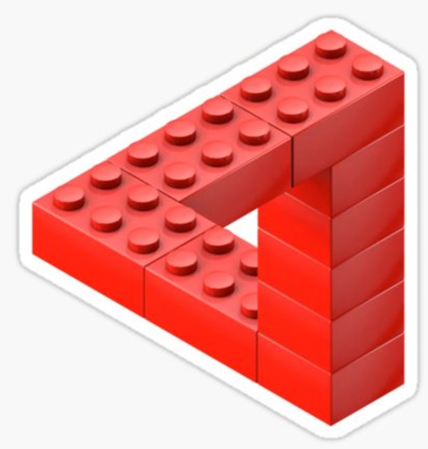
![]() And the winner (with 5 points) is… LEGO SPACE. That’s right the children’s building blocks brand seem to beat the lot of us at our own game. Obviously LEGO have been in business longer than the space organizations most of us work with, but what matters most is (like most leading brands in other sectors) LEGO knows very well about branding. They know what works and what doesn’t.
And the winner (with 5 points) is… LEGO SPACE. That’s right the children’s building blocks brand seem to beat the lot of us at our own game. Obviously LEGO have been in business longer than the space organizations most of us work with, but what matters most is (like most leading brands in other sectors) LEGO knows very well about branding. They know what works and what doesn’t.
See, LEGO SPACE has such as an instantly recognisable spacecraft graphic, that it doesn’t even need to be accompanied by the stylised wording ‘LEGO’. It can be printed on a range of background colors. It is simple, memorable, easy to replicate and unique.
These, and many other factors, are not true for many space brand logos, which is why some space organizations should reconsider how their branding and values are reflected in their logo design.
Logo design characteristics
Most of us have seen the big space brand’s logo graphics so many times now that we instantly recognize them and get a feel for what the organization behind them represents, what they do and how they talk to us. So, good, many are utilizing their logo effectively.
But wait, mention Lego, Mcdonalds, Nike or the name of any of the big consumer brands and the logo instantly pops into our head, we could describe the colors and even do a quick sketch that approximates what the logo looks like. Can that be said of the graphics that represent the organizations we work for in the space industry? Let’s take another look at them…
![]()
![]()


![]()
![]()


![]()
![]()
![]()
![]()
Many of our beloved space brands have got it just right and allowed a good logo designer to input some creativity with the essential best practices used by most big brands – you know, the obvious stuff like using highly contrasting colors – so we can see it properly on different backgrounds, using an aspect ratio close to the golden mean, which allows the logo to best fit the allotted space in many situations, choosing a simple graphic that reflects the brand. And of course rule number 1 – keeping it simple, so that the logo can be replicated easily and remembered by those who come into contact with the brand.
![]() Personally, I think XCOR, UpAerospace and SpaceX hit the mark best with simple and effective logos that work well in any situation and tick all the boxes of what many consider to be great logo design:
Personally, I think XCOR, UpAerospace and SpaceX hit the mark best with simple and effective logos that work well in any situation and tick all the boxes of what many consider to be great logo design:
- Simple
- Memorable
- Timeless
- Versatile
- Appropriate
How logo design can go wrong
Most space brands use professional designers and benefit from best practices that have evolved during the history of logo design. The same is not true for all of the space logos we are expected to remember and build a relationship with. For example, everyone knows Jeff Bezos’ logo for Amazon has that little smiling arrow going from the a to the z – a clever way to say the brand sells just about anything you can think of.
![]() However the Blue Origin logo chosen to represent Bezos’ space brand breaks many of the rules on so many levels. From having a thin generic font, to including an overly complex coat of arms illustration that none of us could replicate in our minds, on paper or, well, anywhere.
However the Blue Origin logo chosen to represent Bezos’ space brand breaks many of the rules on so many levels. From having a thin generic font, to including an overly complex coat of arms illustration that none of us could replicate in our minds, on paper or, well, anywhere.
Rather than let the graphics speak for themselves, Bezos had to do a round of interviews to explain the funny coat of arms. It turns out the motto “Gradatim Ferociter” is Latin for “Step by Step, Ferociously.”
Despite the company having 16 years to consider the merits of good branding, Bezos explains momentum is essential. “You have to do it step by step, but you do want to do it ferociously”. Many have pointed out that the hourglass in the coat of arms is “a Victorian cemetery symbol which means ‘time is fleeting.’ We don’t have forever.”
![]() The Blue Origin branding suffers from another problem, possiby of their own making. Namely having 2 different logos being banded around the web to represent a single brand.
The Blue Origin branding suffers from another problem, possiby of their own making. Namely having 2 different logos being banded around the web to represent a single brand.
The logo depicted on the New Shepard vehicle has an overly complex broken feather that not only disfigures the name of the brand, but is a nightmare to cut out and print with all its whispyness and detail. Worse is that many of the photographs used by news organizations are taken directly after a smokey test launch and landing. Which can make it look like the vehicle has been burned out and dragged through a bush, backwards. Feather and-all.
@BlueOrigin - #branding #logo fatal mistakes - birds with feathers like that, just don't fly. Click To TweetHow could Bezos’ guys disregard logo design best practices for his space brand when they nailed it so well for his eCommerce store? Maybe it was a case of the boss knowing exactly what he wanted and had no need for designer brain-storming sessions. Maybe they just thought they would be different from the crowd, despite knowing that birds with detached, broken feathers like that, just don’t fly.
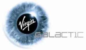
![]() Richard Branson has, over the years, had access to experienced brand specialists, artists and designers too. However, Virgin Galactic’s photo-realistic graphic hides part of their brand name, requires a heap of colors to print and runs the risk of looking confusing at a distance. It’s apparent that many graphics guys trying to replicate and use this logo have had problems.
Richard Branson has, over the years, had access to experienced brand specialists, artists and designers too. However, Virgin Galactic’s photo-realistic graphic hides part of their brand name, requires a heap of colors to print and runs the risk of looking confusing at a distance. It’s apparent that many graphics guys trying to replicate and use this logo have had problems.
A quick Google image search reveals that the pale grey word “Galactic” has had to be moved around the graphic in a range of varying positions in order to make it readable on different background colors – a problem well-designed logos don’t usually have to contend with. And yes, the boss may have to take the blame again – as it has been claimed many times that the all-seeing eye in the logo is actually sir Richard’s eye.
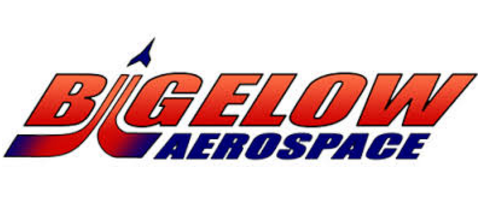 Bigelow’s logo also suffers, but this time due to seeming to be homemade. Try recreating or printing that faded red to blue (primary to primary color) gradient or sticking the image on different colored backgrounds without the numerous border strokes getting in the way. Not ideal for anybody who needs to place or replicate the logo and use the graphic file as an effective tool.
Of course, space businesses should avoid unnecessary risks at all costs, but that doesn’t mean the branding should too.
For example, Sierra Nevada Corp, Loral and even Masten to some degree, seem far risk-averse to mess things up with a motif or a graphic that could restrict or compromise their brand in any way. The effect is that it can seem that they simply pulled a generic looking font off the shelf and pasted their name in there. Job done.
![]() Not suprisingly NASA are famed for having the worst logo in the cosmos, due to a number of questionable moves that have been noted by numerous designers. From tiny, impossible to replicate, stars dotted around the logo to an oldy-worldy serif font, zero contrast between the blue and red when printed in black and white, the list goes on.
Not suprisingly NASA are famed for having the worst logo in the cosmos, due to a number of questionable moves that have been noted by numerous designers. From tiny, impossible to replicate, stars dotted around the logo to an oldy-worldy serif font, zero contrast between the blue and red when printed in black and white, the list goes on.
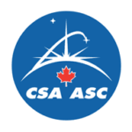
If only the Canadian Space Agency had realised this before copying NASA’s ancient logo they would have had a chance to build a consistent branding logo that their paying public and customers instantly understand and root for. Following the leader isn’t always a wise step, even if you are unsure of your own path.
Space industry logos that work
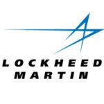
The above examples are not representative of the vast majority of the space sector though. Many of the logos exploited by large space brands and national space agencies have clearly been designed by professionals with a flair for aesthetics. JAXA’s use of a stylised star for their “A” is clever, as is the star in the Lockheed Martin logo (or is that just two death rays radiating from on high?). Other highlights include the use of part of their flag for the UK Space Agency and the simple graphics used by Boeing, ESA and Orbital ATK. All examples of logos that tick every box to effectively do the work most of us don’t realise a logo needs to do for us.
Sure the majority have played it safe by going with a triangle zooming past the brand name in a trajectory pointing up to the skies. And yep, we see that most of our brands are depicted in a blue and/or black color scheme – representing that we are a businesslike, reliable brand everyone can trust.
Arriving at a great logo isn’t always an easy journey though. Change can be painful. Marketing teams that believe they have poor logos first have to convince their organization’s leaders that it’s time for a change for the better. Knowing what is working for others in the same sector can provide a good starting point and understanding why others went the way they did can deepen this insight.
Space logo facts
- 95% of space industry brand logos are worded in conservative / businesslike blue or black
- Over 50% of logos contain an arc, a section of a parabola or circle to represent a trajectory
- Orbital sciences went from rad red to conservative business blue when becoming Orbital ATK
- The Canadian Space Agency are well aware that people think their logo is just a copy of NASA’s
The odd ones out
- Virgin Galactic has the only logo to contain a photo-realistic graphic – which can be a nightmare to print properly
- Bigelow has the only logo with the wording in danger red, with an oldy-worldy gradient applied to boot
- Blue Origin has the only logo to contain a complicated motif and the wording isn’t emboldened at all
- The UKSA know that nobody knows who UKSA is, so spells out its full name and pops a flag in there to be sure
- Sierra Navada Corporation chose such a long name they had to add their initials, (which makes it even longer)
- Loral don’t seem to have a need for a memorable logo or bespoke font, so an off the shelf solution will do
Generic space logo recipes
- Go with a name color of blue or black, or a mix of the two and treat yourself to a bespoke font
- Be sure to add an arc or trajectory with a little triangle on the top to depict a spacecraft in orbit
- If you don’t have budget for an arc or part of a parabola, pop a circle (ie planet) in there instead
- Make your logo a similar proportion to the golden mean, so it isn’t too wide and short or too square
- If in doubt, copy the NASA logo, stick your own initials in there and move the trajectory around a bit
 On a more serious note, it turns out there are lots of common factors seen in space industry logos. Which ones had every common element? Aerojet Rocketdyne, UpAeropace and XCOR, though note, SpaceX would have been in there too if only they had remembered to pay their dues and, like LEGO, stick that elusive triangle at the end of their trajectory.
Final Thoughts
We all know that branding is more than just the logo that represents an organization. Every time our brands interact with the public, with customers or with news organizations, our public image is at risk of being damaged, our products are open to being ridiculed and our well-paid leaders and decision-makers being made to look dictatorial, or worse, cheap.
Using the available resources to come up with a simple motif that perfectly represents us can be more difficult than it seems. For some brands, tribes and individuals, it’s impossible.
Ironically, it was Jeff Bezos (referring to Amazon of course) who said that “your brand is what other people say about you when you are not in the room”. As usual, he is right. And with more and more space sector organizations joining us every year, what should space companies, agencies and their staff do in this era of commercial space industry growth? Invest in blue and black paint of course.


![Yikes! Apparently people have been making Uranus jokes at least since this 1881 edition of the satirical magazine Puck.
[Found by Elizafox System on Mastodon]](https://pbs.twimg.com/media/FwWGy-DWAA4v1SQ.jpg)
