Category

Space Logo Design

“Your brand is what other people say about you when you’re not in the room” – Jeff Bezos


space flight logo brand design
First impressions count. The logo of you space organization, your tag-line, usp, value proposition and call to action graphics need to be tightly aligned to your marketing messages and business goals and are often the most important tools you can use to help describe, and sell, your brand, products and services.

Best practices in logo and branding design apply to the space sector as much as they do elsewhere. Fatal mistakes can not only confuse potential customers about your brand but can also create havoc with printing, and communication strategies. For example, too many colors or graphical elements in your logo can render it unrecognizable from a distance. Including graphics of your current products in your logo can restrict growth and allowing the boss to choose his favorite color, font or motif can run the risk of making your business look unprofessional, oldy-worldy or even cheap.

Using brand designers that have experience in creating effective space business logos, certificates and graphics for use on spacecraft, hardware or digital and printed marketing materials will allow your team to benefit from (and better understand) how the psychology of good branding can set the stage for improved awareness, trust, loyalty and increased business in the space sector.

How to Reinforce Brand Values With Best Practice Logo & Brand Design

Logo Design Do’s and Don’ts

  • Do provide your logo designer with logo ideas created in-house, provide as much background information as possible and allow them to make a selection of draft logo ideas for you to discuss and develop, before settling with a design to represent your company.
  • Do your research, get ideas from competitor brands and sketch from memory, space and non space industry logos. to see which ones are memorable, which are a good representation of the brand and which ones make the company hard to take seriously.
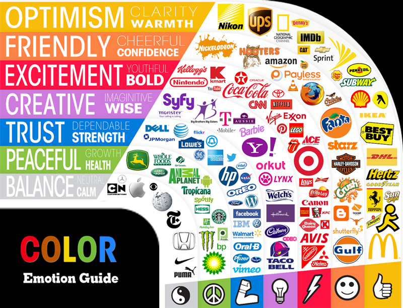
  • Do take into account the psychological effects of the colors used in your logo See how each logo in the below image helps reinforce the marketing positioning and core values of the brand.
  • Don’t forget that your logo is a great way to reinforce your brand values, your mission statement and your unique selling point
  • Don’t restrict your brand by going with a logo that reflects your current products You’ll find it hard to grow out of it later
  • Don’t settle for a logo that only includes your company name in a spacey font – Use your company values to make it personal
  • Don’t make it too wide or too tall – proportions close to the golden ration ensure it isn’t shown smaller than competitor logos
  • Don’t use a detailed mission patch or badge as your company logo – by all means, include your logo in a patch when needed
  • Don’t forget to have your logo designer provide a light and a dark version to ensure enough contrast on dark or light backgrounds
  • Don’t use more than 3 colors, or over-complicate your logo design. Simple but memorable works best to crate the right impression
  • Don’t add trademark symbols or taglines to your logo, and never use your chosen logo font or typeface on wording elsewhere
  • Don’t overdo your logo with complex design elements and too much detail., it will be hard to print or to see at a distance
  • Don’t be like NASA and allow a chief or a committee to design or change your logo for the sake of change. Allow it to evolve, but be consistent