Contents
Since the move, a request to gain permission to use the worm logo was granted to New York-based fashion designer Vivienne Tam and a number of new designs have been seen on products on sale at Target and from the luxury brand Coach.
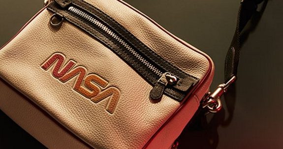
As reported by CollectSpace this week NASA’s Bert Ulrich commented on the upsurge in use of the worm logo after being out of bounds for over 25 years. “It’s not NASA’s official logo, the meatball definitely takes precedence in terms of being NASA’s identifier, but there has been a clamoring for the worm on merchandise.”
Ulrich continued, “It has been very much stressed that the meatball, aka the NASA insignia, is the agency’s official identity… It is wonderful, though, that people still like the worm, and people are excited by the feel of it.” Like it? Many polls have indicated that its more of a case that people have a major dislike for ole meaty.
NASA - 'There has been a clamoring for the worm logo on merchandise' #NASA #logo Click To TweetIs this the beginning of the end for the meatball?
In any organization that has to pay its way and compete in a free market, branding matters. Not only do commercial companies need to be seen to provide great customer service, quality products and value for money, they also need to use every trick in the book to survive amongst their competitors.
 This reliance on exploiting branding methods that have been shown to encourage customer loyalty and generate a strong emotional attachment from users and customers is usually essential and a recognised, loved logo is often paramount. Not so with NASA.
Despite NASA having heaps of talented designers, marketers and wordsmiths at hand, the organization suffers badly from their important branding decisions being made by bureaucrats. This is why, despite having placed a lot of effort in improving their public relations and their brand, NASA is still tied to their unpopular, ancient logo.
In this post, we will see how this logo came into being and the mistakes that were made that led to what has been termed by some people as a design nightmare and one of the worst logos in the cosmos.
The history of NASA’s logo
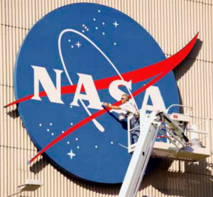
 The current NASA logo, which is nicknamed the meatball after the “meatball landing system”, features a blue sphere that stands for Earth and/or other planets.
The interior of the sphere has white stars that represent the space, the word NASA for the agency, an orbital path for spacecraft, and a swooping red chevron that represents aeronautics.
This logo has been in use since 1992, but its history can be traced back to 1959 when the agency was established. Below is a chronological list of events that led to the current logo.
1. The NASA Seal
After the formation of the NASA agency in 1959, it was suggested that a new seal should be designed, which was to be used for less formal reasons – perhaps promoting the agency. The responsibility of designing the seal was given to James Modarelli, who was the head of the, urr, Reports Division at the Lewis Research Center.
An initial design was made, which featured a blue sphere surrounded by the full name of the agency – National Aeronautical and Space Administration U.S.A. Inside the sphere were white stars, a small white sphere, a larger yellow sphere, an orbital path, and a red chevron. When the design was given to Modarelli, he chose to simplify it by removing some of the features, thus leaving only the blue sphere, the white stars, the red chevron, and the orbital path. He also added the letters N-A-S-A in an oldy worldy serif font inside the blue sphere.
This design became the official NASA logo, and it was used until 1974 when the agency started facing a number of publicity problems – it was around this time that the logo was nicknamed “the meatball”. There were also a lot of complaints about the logo, which included difficulties during printing, visibility issues, poor color contrast, etc. As a result, the agency finally gave in to the advice of designers and went for a full redesign in an effort to improve their brand image.
2. The NASA worm logo
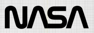 Following their publicity problems NASA hired two graphic designers – Richard Dane and Bruce Blackburn – to design a more modern, futuristic, and simple logo. These chaps came up with a simple but very appealing design that later became known as the NASA “worm” logo. This new logo featured the words NASA printed in thick red letters, and with the strokes of the letters A removed. The letters of this bespoke type-face also came with an appealing, streamlined, zigzag design.
According to Richard Dane, the new logo was progressive, clean, easily visible (he rightly claimed that it could be seen from miles away), and was very easy to use on any type of medium. It was also very simple, as opposed to the meatball, which had many features, each one of them representing different elements that it seems a committee had thrown in for good measure.
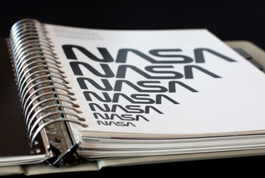
In addition, the logo came with a NASA Graphics Standards Manual, a guide that outlined how it could be used in various mediums, including use on spacecraft, clothes, equipment, and stationery. NASA adopted this new futuristic logo in 1975, to the joy of the agency’s staff and the general public. However many people at the agency, especially senior management were not very cheerful about it, and as a result, the logo would not last very long.
3. The return of the meatball logo
 Despite the great design, the new logo faced a lot of resistance at the agency. In addition, the final decision on the logo was left in the hands of engineers and more bureaucrats at NASA, who were accused of knowing very little about graphic design, branding or marketing in general.
The NASA worm logo was axed in 1992 and the NASA meatball was re-introduced, in an attempt to help increase employee morale following several hurdles in the agency’s space program – for example the Challenger disaster.
The meatball logo has been in use since then, and apart from its use on a number of distant spacecraft the NASA worm has only been used on special occasions. Until now, that is.
Why is the current NASA logo considered a failure?
The NASA meatball is popular with many NASA employees and some members of the paying public, probably due to the nostalgic effect it gives due to its association with early NASA successes. However, away from these people, the logo has received a lot of criticism, especially from experts. According to Stephen Loges, one of the graphic designers who worked on the NASA Graphics Manual, the decision to switch back to the meatball logo was “going back to the past” as opposed to “back to the future” as the NASA management suggested. The logo was also criticized for several others issues such as:
1. It was not designed by graphic designers
One of the main problems with the NASA meatball logo is that it was not designed by a professional graphic designer, but bureaucrat engineers who may not have known much about the effects of good graphic design. This led to the creation of a branding logo that is considered by many people to be amateurish. Michael Bierut, a famous graphics guy from New York design company Pentagram, has even been quoted to having referred to the meatball logo as an “amateurish mess”.
2. The idea for the logo is quite old
Another reason why the current NASA logo is often cited as one of the worst designed brand logos is because it is based on a very old idea that was developed in 1959 when the agency was being founded. An era during which government agencies put very little thought into branding themselves and it was standard to use serif type-faces and incorporate multiple elements seen on shields and mission patches.
NASA management could, have stuck with the futuristic worm design instead of switching back to an old idea that had become outdated – developments and trends in graphic design had come a long way since 1959, with the emergence of new fonts, styles, ideas and technologies, but making a decision that may rock the boat was not a risk anybody wanted to take.
3. It involved a lot of people, mostly management
 The NASA meatball logo was designed with input from a whole bunch of people, especially the management. This means that a lot of elements were added into the design, as if a committee had the job of ensuring the elements they wanted to be added went in there as well. Therefore, the creativeness of the logo was tainted further.
4. It is quite complex for a banding logo
The logo comes with many features, from the blue sphere, the stars, the red chevron, and the spacecraft’s orbital path, which all represent something. Therefore, it takes you quite some time to fully grasp what the logo represents. One running joke about the logo is that the red chevron actually represents the red tape that created it.
NASA's logo irony - 'the red chevron actually represents the red tape that created it' #NASA Click To Tweet5. It causes a lot of problems during use
Using the NASA meatball logo is a headache and various design issues about have been outlined on NASA’s website. Some of these issues include:
- Problems printing the logo on stationery paper due to the stars in the logo disappearing.
- Problems when printing the logo using a colored copier due to the blue background color of the sphere having little contrast with the red chevron.
- The appearance of the logo is not great when it is manipulated into a three-dimensional image
These design issues are what led Gregg Patt, a Graphics Manager at a publishing services firm contracted by Lewis Research Center, to refer to the logo as a “design nightmare.”
How is the NASA worm logo better than the meatball?
The opinion that the NASA worm logo is better than the meatball logo is widely accepted by many people. Below is a look at some of the reasons why most people prefer the worm logo:
1. It features a simple, memorable design
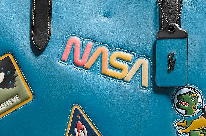 One of the best things about the NASA worm logo is that it comes with a very simple but professional design. This is quite different from the complex and amateurish design of the meatball logo, thus making it quite easy to understand, recognize and identify with.
This opinion is captured greatly by Alice Rawsthorn, a design critic, who in an article titled Art of the Seal states that while the meatball logo shows you what is great about NASA, the worm logo will only suggest it but with a very great skill, thus making it the favorite logo for design purists.
The simple design of the worm logo also makes it very easy to use with any form of medium. This is because it does not have the same limitations as those of the meatball logo, meaning that you can print it on any color background, in black-and-white, or even use it in 3-dimensional with great results. It can even be reproduced easily on fabrics and difficult print mediums – try getting a sharp edged design of the meatball logo embroidered onto a patch, it just looks awful up-close, even if you omit the “stars” and dots splattered around the place.
2. It is very appealing
The logo features a very stylish design – the streamlined and zigzagging letters, and the missing strokes on the letters A, which makes them appear like rockets that are waiting to launch. This attractiveness gives the logo a very appealing look when used on NASA spacecraft, equipment, clothes, stationery, etc.
3. It is more modern and futuristic
Unlike the current meatball logo, the worm logo was more modern and futuristic, which is exactly what is needed in a space industry logo. The confident, attractive, and modern design of the logo was a clear message to the people all over the world that NASA was headed towards a brighter and bolder future, thus giving it a huge public relations advantage over other space agencies it was competing against in the race to the final frontier. Despite many other space agencies’ attempts to copy the logo for their own nation’s space programs.
4. It was professionally designed
Another area where the worm logo outdoes the meatball is in the professional nature of the design. When developing the worm logo, a professional graphic design company was hired while the design of the meatball was left to NASA engineers and bureaucrats, who have often been described by the meatball critics as to having very little knowledge or care about graphic design practices. Therefore, the worm logo presents a very professional brand image.
'Bureaucracy is the death of all sound work' - Albert Einstein #NASA #meatball #logo Click To Tweet
The debate about the Worm versus the Meatball is one of the most contentious issues when it comes to logo design, especially with regards to space industry logos. While the meatball logo has received support from several people over the years, there is no doubt about the fact that it comes with several problems, something that NASA itself has admitted.

There is also a very popular opinion, especially among graphic designers and marketing experts, that the worm logo has a better design than the meatball – which is evident from the fact that the logo won the esteemed Presidential Design Awards for Design Excellence.
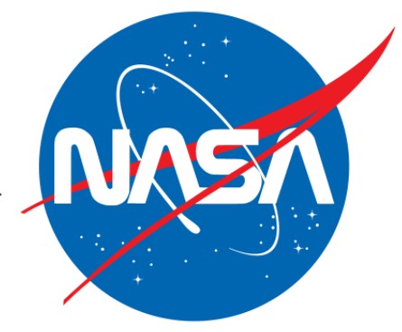 However, with the meatball logo boasting of a lot of support from the NASA management who are in charge of the logo development process, NASA ended up axing one of the best logos in favor of one of the most disliked logos of all time.
Nothing lasts forever though and as Ulrich recently stated about the move to allow the worm logo a new lease of life “Legal gave us permission to use the worm in a manner such that it keeps with the idea that it is retro.”
So despite the new use of the beloved worm logo on NASA merchandise, it likely will not be coming out of retirement just yet – Unless of course, sales of the worm logo continue to increase and out-perform that of the meatball and the old guard decision-makers take another look at what the rest of us have been saying all along. Watch this space…



![Yikes! Apparently people have been making Uranus jokes at least since this 1881 edition of the satirical magazine Puck.
[Found by Elizafox System on Mastodon]](https://pbs.twimg.com/media/FwWGy-DWAA4v1SQ.jpg)
