![]() As a spaceflight company, Blue Origin specializes in the development and manufacture of various technologies and space systems to enable commercial spaceflight. Some of their notable products include:
As a spaceflight company, Blue Origin specializes in the development and manufacture of various technologies and space systems to enable commercial spaceflight. Some of their notable products include:
Blue Origin is intent on becoming one of the leading providers of suborbital spaceflight services, which include the “Astronaut Experience” program that provides spaceflight experiences to private citizens. The company also offers payload launching services to space and non-space businesses, government agencies, institutions, and other civilian businesses.
Bezos and co know how to grow a business, see his letter to Amazon shareholders here. The company, which is based in Washington, United States, boasts of partnerships with some of the top brands in the space industry, for example, NASA, Boeing, and United Launch Alliance (ULA) and others.
Despite the often-cited clever arrow that spans the A to Z in the Amazon company logo, Blue Origin seems to be intent on breaking all the rules. Oddly, the brand doesn’t seem to have decided on a single logo as sometimes it is shown with that unprintable feather and other times with an even more broken feather. Other notable logo features are, well the lack of features. No indication of its relation to space exploration, no bespoke typeface to add character and always shown in a bright, and I mean bright, blue color that persists throughout the website.
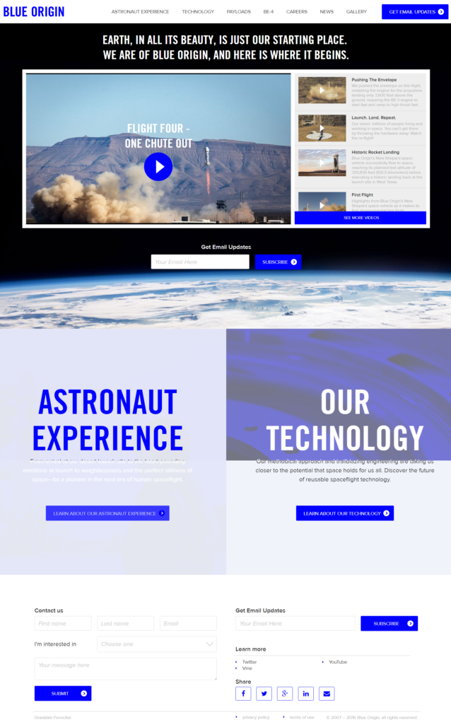
Despite being built on the feature-rich Expression Engine platform, Blue Origin has not made use of many of the great features that are available. The homepage consists of an image slideshow but the accompanying text is so tiny that the majority of space industry staffers won’t be able to read it easily and the light grey text on white background adds to this difficulty. Despite this, if you dare delve deeper, the sub-pages of the site have lots of high-quality images and videos, which are used to help increase the aesthetic appeal of the website layout.
Despite the logo and layout seeming to suffer from overly strict, and miss-informed brand guidelines, the lack of a meta description (seen in the search results) for the homepage (or for that matter, for most pages) show’s that Bezos and co are happy to allow Google to describe what the site, pages and brand is all about. This and the fact that every job listed on the site generates duplicate content on 2 distinct urls are the biggest issues holding them back from a clean, efficient crawl by search engines.
That bright blue color the company decided on for their logo seems to have come back to bite them, as their designer chose to use it for the main call to action color (for all buttons, headings, and image colors). This makes it difficult to see which elements are important and forces a “brightness arms-race” where all of the elements compete for attention. Fortunately no visitor would be able to miss the huge basic contact form at the bottom of every page.


