 JAXA, the Japanese Aerospace Exploration Agency, the national agency that is responsible for Japan’s Aerospace program. The agency was formed in 2003, following the merger of three other space institutions: the National Space Development Agency of Japan, the National Aerospace Laboratory of Japan, and the Institute of Space and Astronautical Science.
As the leading space organization in Japan, JAXA is involved in many activities including:
Being one of the leading national space agencies in the world, JAXA has been involved in a number of space missions. Some of their top programs the agency needs to communicate and market for include:
JAXA is also planning several future space missions, which range from development of satellites and space launch vehicles to launching deep space exploration missions.
The space agency’s logo benefits from a bespoke type-face that has been stylised to make one of the “A”s look like a star. This works really well as the arcs that make up the star also form the curvature of the Earth and install a feeling of movement. Usually depicted in a soft blue color, the logo can easily be switched to white whenever it is needed to be placed on a dark background. This simple logo is easy to spot on spacecraft, hardware or digital and print marketing materials. In short, a very professional logo.
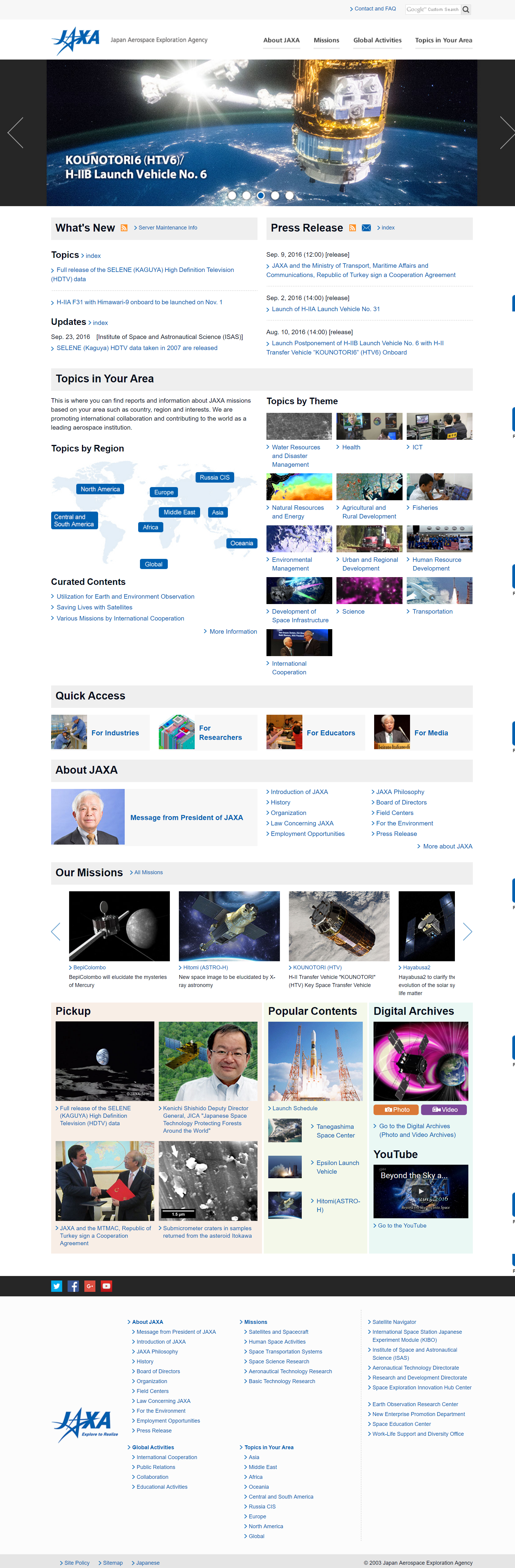
The site enjoys a lot of white-space (actually its light grey, which works much better than glaring white behind dark text). Most of the links use the blue, as is the background of the large dropdown menus. High-quality graphics are used in image links, slideshows and section headers. Both a grid-based layouts and a simple vertical column layouts display content in modules that efficiently guide users to the different sections of the site, including items categorised by country, topic and mission.
A large number of the Japanese Space Agency’s pages can be accessed at 2 different urls, forcing Google and other search engines to guess which of these duplicate content pages to include in the search results. Examples of this ambiguity include the trailing slash and the index.html urls of many pages. The site also suffers from containing over 500 broken internal links that have not been fixed in order to help the agency’s website visitors enjoy a better experience whilst navigating the site.
As an agency, JAXA are most focused on providing information to the general public, as opposed to encouraging potential customers to get in touch about the services. For this reason, there are no real calls to action elements other than the social medial profile links and a link to the contact page.


