Contents
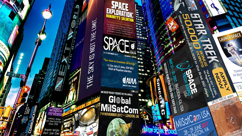
Space related ads enjoy highly visible placements on a range of space news sites that get tens of thousands of views per day. These sites include spaceref.com, spacedaily.com, nasawatch.com, spaceflightnow.com, thespacereview.com, nasaspaceflight.com, spaceflightinsider.com and others. Most of them spend a fair bit of effort attracting the advertising revenue that keeps them online.
But it is clear that the majority of the organizations advertising on these sites are leaving a fair amount of money on the table when it comes to garnering the increased awareness, news coverage and even sales they are trying to attract.
I mean, where else could you see advertisements from well-known brands that forget to mention what it is they are advertising? Where else could you see ads for events that have already happened? And what other billion-dollar industries have members (that claim attention to detail is essential) who are happy to pay for adverts that promote services that are no longer even on offer?
That’s right, space related ads cover a variety of products and services, promoting huge spacecraft manufacturing giants to Amazon books by former NASA staffers. However only 30 or so individual ads take all the advertising real estate on the vast majority of space news websites. And because of this low competition for ad space, it is not a surprise that ads range from those that are professionally designed with cleverly worded propositions to ads that have been cobbled together in a way will never generate the clicks they were intended to generate.
Ok, so you don’t need to be a madman advertiser or need to run a groundbreaking ad campaign to get your message out there, but your space organization’s advertisement does still need to make sense. Those of us with a marketing background will be sure to keep the AIDA checklist in mind – which helps us word compelling ads by:
- Grabbing people’s Attention
- Keeping them Interested
- Creating strong Desire
- Calling them to Action
Failing this, simply remembering to focus on objectives and including the relevant what, why, who, where or when details are a good rule of thumb for those who are unsure what to put in their ad. Especially for those who feel that just having a graphics guy include an image of the brand logo will do the job of promoting your brand.
Conventional wisdom says #space #advertising is high quality & highly competitive - Not so Click To TweetSpace Advertising Stats
Below you can see a selection of the ads that have been scooped up from the previously mentioned space news websites between April and July of 2017. But first, here is a summary of the findings:
90% of online space ads don't list a product, its benefits and a call to action Click To Tweet
82% of online space ads are over 300 pixels wide (the average website column) Click To Tweet
50% of online space ads advertise space related products for the general public Click To Tweet
33% of online space ads advertise forthcoming aerospace conferences and events Click To Tweet
30% of online space ads don't even mention what product or service is being advertised Click To Tweet
16% of online space ads just show a company logo or a brand name and nothing else Click To Tweet
Space Service Providers
Lockheed Martin

Unlike Boeing, the ULA, Masten or other large firms, the organization advertises their brand even when there is nothing particular the firm wants to to market or sell on their site at http://www.lockheedmartin.com.
Orbital ATK
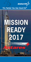 Intent on keeping their brand in the mind of us in space industry, the nicely designed ads that click through to the www.orbitalatk.com homepage work well to inform us they are a major player in the industry and a partner we can count on.
Nicely designed using the brand colors and logo, these online ads enjoy graphics that remind us of their capabilities. There is good use of spacing and the wording helps reinforce their positioning as a leading force in the space industry. These are really nicely designed ads that do their job well to encourage viewers to click throug.

NanoRacks

Conferences and Events
Space Tech Expo

Private Space Science

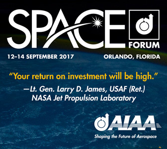
AIAA Forum
With good use of logos on a contrasting background and all the info visitors need to see in order to decide if the event is in a location they can visit, the ad is one of the better ones created for an annual space industry event. It’s got to be said also that the site this links through to is nicely designed, informative and easy to navigate. A job well done and a good experience for those clicking through.
MilSsat USA
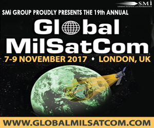
Bold and easy to read, in white and yellow text on a black graphic of a military satellite trained on, urr, the USA, this UK based conference ad was obviously created by the SMI agency that is happy to mention itself before their client in the ad.
On clicking though, rather than visiting the advertised domain, one is redirected to a landing page hosted on the SMI site at http://www.smi-online.co.uk/defence/uk/global-milsatcom. Either an oversight or a change in plan that didn’t get fully implemented.
MilSatCom USA
Likely due to the USA site not being ready in time, or not existing, they chose to stick with the erroneous ad text rather than make the quick change in design. We must just assume the client is happy with the error and pay more attention to detail when it comes to making military satellites.
Again, nicely designed with all the info needed to encourage click through from space news sites, but again the agency is keen to sneak a free mention of SMI at the client’s expense. Cheeky to say the least.

Military Satellite IQPC

Explore Mars Summit
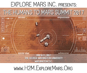
Furthermore, the ad provides all the required information needed to encourage visitors to click through and is a good way to grab the relevant sections of the space community that are most interested in sending Humans to Mars by the 2030s. The only improvement that could be made to this ad is that the text describing the event location is far too small to read. This is usually the case because graphics guys have huge screens, unlike the rest of us.
ICAS Space
Interestingly, although the homepage of the site does well to inform visitors about what they can expect from the conference, it does seem to be broken, due to the huge area of white space beneath the main content. Either way, the ad works well to pull people towards the site.

Cryogenics Workshop

Aero Montreal

Space Organizations
Space Florida

NASA Federal Credit Union

LaunchSpace

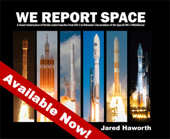
We Report Space
Unlike the majority of events or conference ads – who enjoy designers that remember to mention what it is that is on offer, this ad expects visitors to click through in order to find out more. Which generally isn’t the way it works. Shame because their insight into the industry seems highly valuable and entertaining.
Space Tec
Because there is no indication of what they do, how they do it or why we should engage with them to give them our attention or money, the ad is typical of those that were born from a manager saying “we need an ad with our logo on it” and all thought ending right there.
AeroStem Consulting

Novotech Load Cells
The UK company have a long history of providing load cells to the aerospace and space industry around the world and as their site explains, “Novatech has been manufacturing loadcells since 1972. We offer the latest analytical techniques and a flexible approach to loadcell design. Our factory has total in-house design, manufacturing and calibration capabilities. All of our resources are dedicated to product integrity”. Fortunately though, they never tried to squeeze all that into their ad too.

Space Consumer Products
Photo Space
Anyways, for the record, they offer a great service at a great price – spoiler alert: “Sign up today and send your pictures into outer space!” (a detail that should be visible in all of their online advertising). Read about it at www.photostospace.com.

RealSpace Models

With the option of using animated ads that give the advertiser lots more space to get their message across, RealSpace missed a trick by not using the AIDA checklist – to attract Attention, get people Interested, create Desire and call potential customers to Action (with their advertisement and marketing copy).
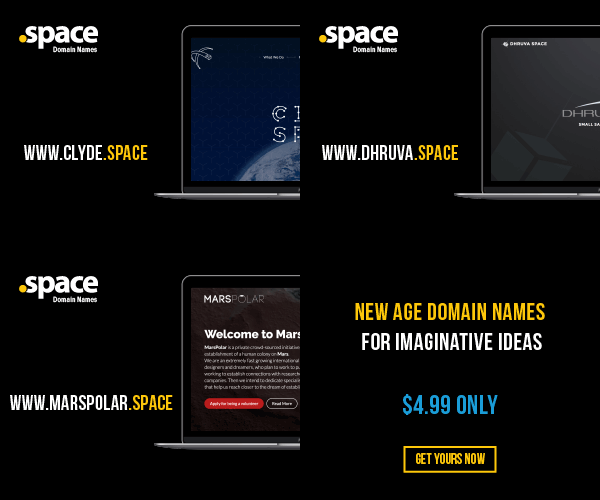
Launch Space Domains
By working with domain registrars and buying up heaps of .space top level domains (TLDs), ie website domain names that finish with the word space after the period – Launch space are interested in tempting new space brands to buy a domain name from them.
The animated ad explains all of this by showing examples and they describe the proposition more fully at their landing page at www.launch.space.
Humanity’s Salvation Book
In Space Exploration: Humanity’s Salvation, he challenges readers to reignite their interest in space travel. By getting infront of the eyes of those in and interested in the space industry Joe’s online advertising campaign not only increases the chances of selling lots of books but also ensures lots of people are exposed to his work – visible at https://www.amazon.com/Space-Exploration/

STEM Toys
Linking to the Amazon landing page that lists the Stem Picks collection, this ad is a great example of using nice graphics and typefaces – which is often overlooked by other small brand ad designers that tend to create home-made looking cheap and nasty graphics.

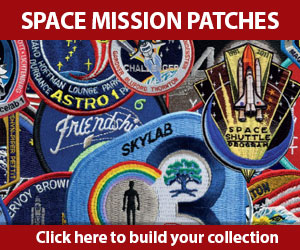
Astronomy Patches
The magazine features articles ranging from how to observe the night sky to the latest discoveries in the Solar System and in deep space. To find out more about the patches and their prices you will have to delve into the site.
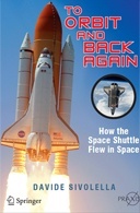
To Orbit and Back Again
Despite the ad being small, it serves the product well and because the ad is an online adverisement the author will likely only incur costs when people actually click on the ad. That means that all the unclicked ad views is free coverage.
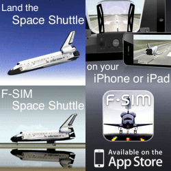
Flight Sim App
Space Walk App

Curiosity Steam
 CuriosityStream is a global ad-free subscription video on demand service. It exclusively delivers nonfiction documentaries and series about science, technology, history and nature.
The ad they have on display on a number of space news websites promotes the Next World documentary with Michio Kaku. By including their logo, a pic of Michio, the product name and tagline the ad works really well. Better still, the ad design also incorporates a call to action button that offers something for free – always a winning move when it comes to enticing visitors into clicking through to find out more. See how they take you further down the sales funnel on their landing page at https://www.curiositystream.com.
Final Thoughts
 So there we have it, 30 or so ads by organizations that believe advertising on the most popular space news websites will generate increased brand awareness or make more sales for their products, services or events. For the record, here is the ad I use when I need to get word out about my space sector marketing services.
As expected some of these ads are good, some bad and some ugly. Despite it only costing the less experienced marketers and graphics guys 3 minutes to Google “advertising best practices” or other such phrases, it seems that the big guys in the industry enjoy the most successful campaigns due to their better informed tactics.
Want to know where the best places are to advertise your space, aerospace, satellite or spaceflight brand? Watch this space and sign up to email updates as a full study of the space based sites that allow advertising, along with figures of the numbers of visitors each gets, is in the pipe-line.




![Yikes! Apparently people have been making Uranus jokes at least since this 1881 edition of the satirical magazine Puck.
[Found by Elizafox System on Mastodon]](https://pbs.twimg.com/media/FwWGy-DWAA4v1SQ.jpg)
